Information Architecture and the new MAAS layout design
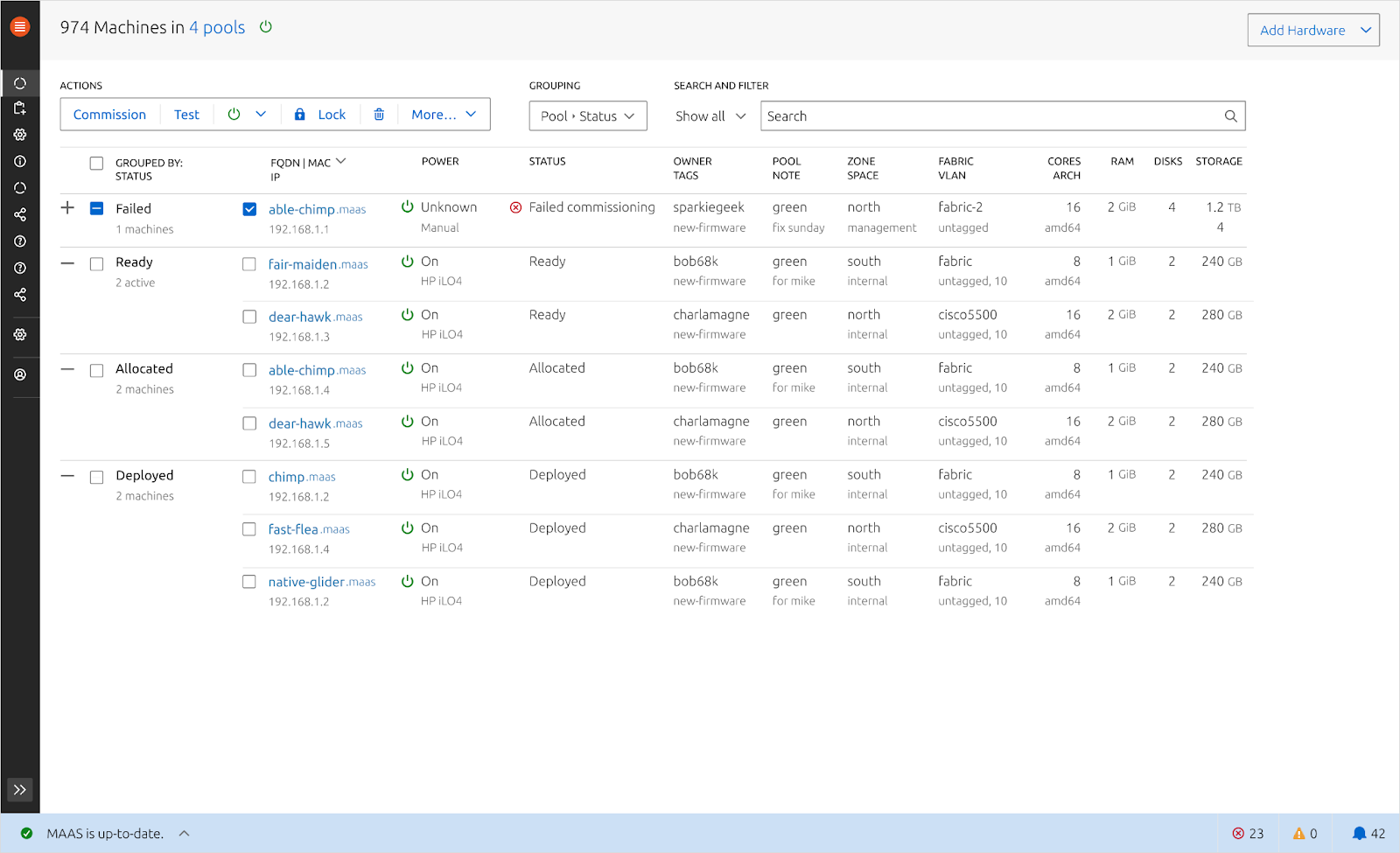
This 2 weeks iteration we ran a design sprint to quickly prototype the new MAAS layout design. In the previous release, we created an experiment to figure out 3 different Information Architecture possibilities and we selected the one that makes the most sense to test out the new MAAS layout. This is the first phase of our revamping process and there is still a long way to go.
Here is the prototype if you would like to play with it.
Because we had a very limited amount of time to work on this project, we scoped our work to test out 3 main components in the UI; the new MAAS Information Architecture, the action bundle and the bottom status bar. We did a rapid prototyping style user-testing with 6 MAAS users from different environment categories. While testing out this prototype, we focus on 3 aspects of the design; learnability, efficiency, and error tolerant.


The design above went through several iterations of redesigning during the testing phase and here are the learnings that we got.
-
Navigation: A few people find the concept of spaces out of place in the navigation, because they feel that it belongs in the Networking tab and it’s functionality was not used as frequently.
-
Quick-access machine listing column: 5 out of 6 people were really excited that there is an ability to switch between different machines to view its details, because we’ve discovered that many users had to open up several tabs for 2 reasons; 1. They are trying to compare configurations between different machines, 2. In a huge MAAS environment, it can take longer to load the entire list of machines.
-
Bottom status bar: In our earlier prototype, we found that we were trying to fit in 2 purposes in one concept by adding both local and global statuses in this area and the white background colour made this bar out of sight, so a lot of information that we surfaced was not getting enough attention. As a result, we decided to only include global statuses in this area and changed the background colour to make it standout.
-
Action bundle: In the previous MAAS design, we realised that the
Take Action button is too far from the interaction point and there are too many actions inside the dropdown, so the complexity score is quite high. So in this prototype we broke down the take action button by the most popular action and moved it closer to the interaction point. We hope to make it more contextual by showing the right action for different machine statuses.
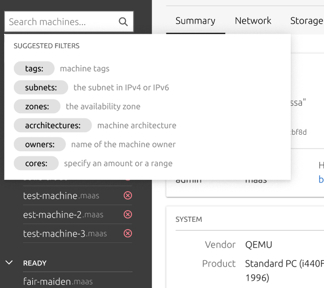
Our next step after we finalise these 3 components is to focus on how we can tailor the advanced search and filtering functionalities to match with how people work as well as templating machine profiles, and notification center.
Sharing Feedback about the UI with us
For anyone who would like to share their experience or tell us how you query your search in MAAS (or any other relevant experience in our next topic) feel free to share your feedback/thoughts with us in this thread!

MAAS react migration sprint
Continuing from our last week planning work to migrate MAAS to react faster, we’ve joined forces with other web-team members to quickly turn the angular legacy pages to react.
In this sprint, we did a pair programming style sprint, where we on-board the web-team members with MAAS architecture and how the API works. Then we split tasks into different components and pages for each pair. So far we’ve made really good progress in the UI where the Availability Zones and Subnets page are now in React.
The next step for this migration is to summarise our work task, clean up, and refactor code in a few places before we ship it.
1 Like
@dandruczyk, @pjonason, @evan.sikorski, @szeestraten: please take a look and comment, if you get a chance. tia.
2 Likes
Thank you for the notice about these upcoming changes, and some screenshots of the prototype. I don’t have strong opinions about much of the detail, but there is one item which I am quite concerned about: Horizontal space. Sometimes I will maximise a browser window, but I detest the notion of being forced to, just to see summary info of my machines without scrolling sideways. As it is I reduce the font in various situations to try to get things to fit, but it’s a bit of a struggle at times.
Do you have a pixel width (or inches or something) maximum that you work within?
To that end, I have only two ideas, but don’t particularly mind how it is addressed - assuming that is possible at this stage. I note that you already have ‘sub-text’ for each field which is below the ‘main text’ so that helps with horizontal space use.
- Don’t move the menu from the top (as it is now) to the side
- Give some options to hide unwanted fields
I see the menu can shrink down to icons (including when there is a submenu showing) which will help. Popping out again still means the width has to be used at certain times.
Not being a UX designer I’m not aware of all you are trying to achieve, but appreciate the efforts. I guess with this feedback I will sit back and hope that I’m not stuck scrolling sideways to see info or forced to maximise or shrink zoom to ridiculous %.
Regards,
Greg.
1 Like
hi @gregoryo2017, Thank you for your feedback. You can visit this link to see more screens : prototype. Most components are clickable and hoverable. (This is not the final version, just a very fist stage exploration phase)
In this prototype we work with the standard 1680 pixel size (width) and we have 2 other breakpoints by default but those are not in this design yet.
It would be helpful to know why we shouldn’t move away from the horizontal menu style (the current MAAS) and why you care about the horizontal space (as of having to maximize the browser window).
(There is no right or wrong answer, it’s just a matter of us understanding what is the actual struggle that we haven’t considered.  )
)
For instance, it would be helpful to know
- What are you trying to achieve by zooming in and out of the browser? Is it because your machine names are really long that it breaks the table?
- Could it be that there are certain columns that you don’t care about in the table?
It would also be helpful if you can add a screenshot of what it looks like when you try to maximize your screen (so we understand why you need to do that, which information turned out to be useless/useful, what breaks).
When we started working on this version we found that the horizontal menu is not scalable and it adds a lot of cognitive load having to move your eyes left to right all the time.
Thank again for your feedback. These are very good suggestions.
1680 explains it - even with my new big high res monitor, half width is still 1268. No hope on the second one at 948 half.
0x028001df 4 1938 16 1268 1424 . Machines | maas MAAS — Mozilla Firefox
I use a tiling window manager so information is available without hiding windows. I can sometimes dedicate a monitor to MAAS web ui, but that’s not always optimal.
Playing around with it a bit, my concerns are in the Machine listing display, and showing the page for a Subnet.
In Machines, it is less the machine name (although longest name does require uncomfortably small 60% zoom for 948 pixels), more the other columns which get truncated: Status, Owner and Tags. Allowing me to configure 2 Machines ‘views’ could fix this - most of the time I don’t want to see how many cores, RAM, disks, storage, arch a machine has, because I know the hardware by its name, zone or pool. Tags are much more variable, and good to see in full.
In a Subnet, even at 2544 pixels the Last Seen column is still truncated, while at 1268 Node is truncated unless I go to 80% zoom, with the latter being more of a problem. This seems solvable, since there is generous whitespace between the columns.
I don’t (think I) experience cognitive load moving eyes left to right, and between top menu and left menus because of their different nature - top is the big sections, left is contextual or sub-menus. I’m reminded of Bitbucket, which we use and noone has pointed to the menus and web ui layout as a problem.
I recognise that full customisation of data display is through CLI, which we increasingly use, but the web ui is still a very useful tool for general overview operations and scripts we haven’t written yet.
HTH,
Greg.

 )
)